Oculus
Spring 2021
Team
Individual
Skills
Rhino, Photoshop, Digital fabrication, Illustrator, Grasshopper
Course
ARCH 1502 - Visual Representation II: Media of Representation
Goal
Create a window derived from a Gothic cathedral façade, as well as design and fabricate glasses to view an anaglyphic projection of the façade.
Anaglyphs.
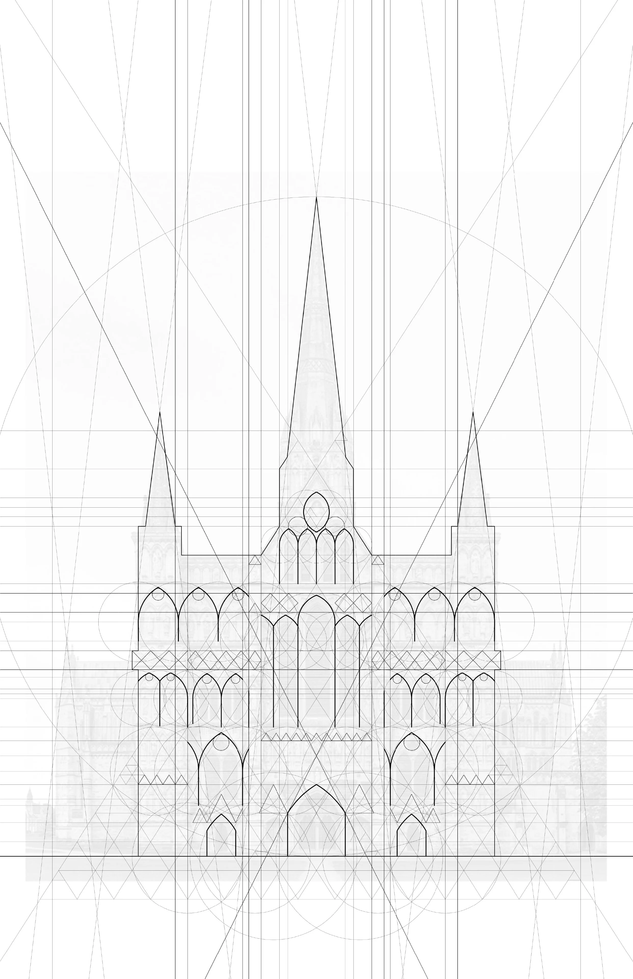
The first part of this studio involved an exploration of geometric relationships in an façade of the Gothic-style Salisbury Cathedral. I first used regulating lines to determine significant orthogonal and diagonal alignments. Next, I drew circles of varying sizes and constrained their edges to the regulating lines, offering a logical yet undefined organizational structure. Last, in increasing fidelity, I added more layers to uncover how the regulating lines and circles ultimately provided the constraints to discover the existing elements on the façade.
For the following part of the studio, the geometric relationship identified on the façade had to be used as the basis of a novel geometric figure. Based on the geometries I drew on the façade, I identified that many of the actual façade elements were made up of intersections between various shapes, such as the windows and doorways.
Therefore, I chose to create a figure with the word Interwoven in mind.
I then isolated the circles I had drawn and connected them with sweeping curves, cropping their overlapping segments to sell the notion that they were interweaving with one another. Last, I added offset lines to enhance the overlapping effect by creating perceivable shading.
The last section of this part of the studio involved translating the linework into multidimensional anaglyphs. The anaglyphs were generated by entering the linework as an input into a Grasshopper script, which then took in parameters such as depth and spacing to enhance the three-dimensional effect of the anaglyph.
Click on each image to enlarge and see in further detail.
Anaglyph of the Salisbury Cathedral façade.
Anaglyph of the interpreted drawing based on the word Interwoven.
In order to properly view the anaglyph drawings, the capstone task was to fabricate 3D-viewing glasses. Since I wear glasses, I decided that my design would accommodate the fact that my sight-correcting eyewear must sit close to my face.
The overall form was inspired by my recurring theme of Interwoven, leading me to use individual layers in additive and subtractive ways to create the idea of overlapping.
This led to a design with a lower nose bridge, effectively raising the glasses’ lenses as the frame sat lower on my nose, and larger lenses to make it as likely as possible that my sight would be through the red and cyan filaments.
The design materials consisted of five laminated alpha core sheets produced by laser cutting, as well as red and cyan plastic lenses, two sets of double-layered temple pieces and two side caps to hold the entire frame in place.
As you can see, they ended up fitting quite nicely!
2. Window.
After completing the drawings and analysis of the Salisbury Cathedral facade, the next task of the studio was to design a window derived from features of the existing facade. I chose to center my design around one of the cathedral’s existing windows, which is entirely made up of recursive elements.
Salisbury Cathedral window. Source: https://www.uksouthwest.net/wiltshire/salisbury-cathedral/salisbury-cathedral-chapter-house-windows.html
First, I isolated a pair of recurring elements that could be used together to create a new and single form.
Maintaining the motif of Interwoven as with the previous part of the studio, I combined the two selected window pieces into a single sweeping member. Additionally, I used the concept of overlapping to tie in the notion of interweaving that such a visual feature may stimulate.
After slight modifications to the selection, I then chose to fixate all attention towards the single moment of interweaving, as this was the central feature I wanted to convey in my design.
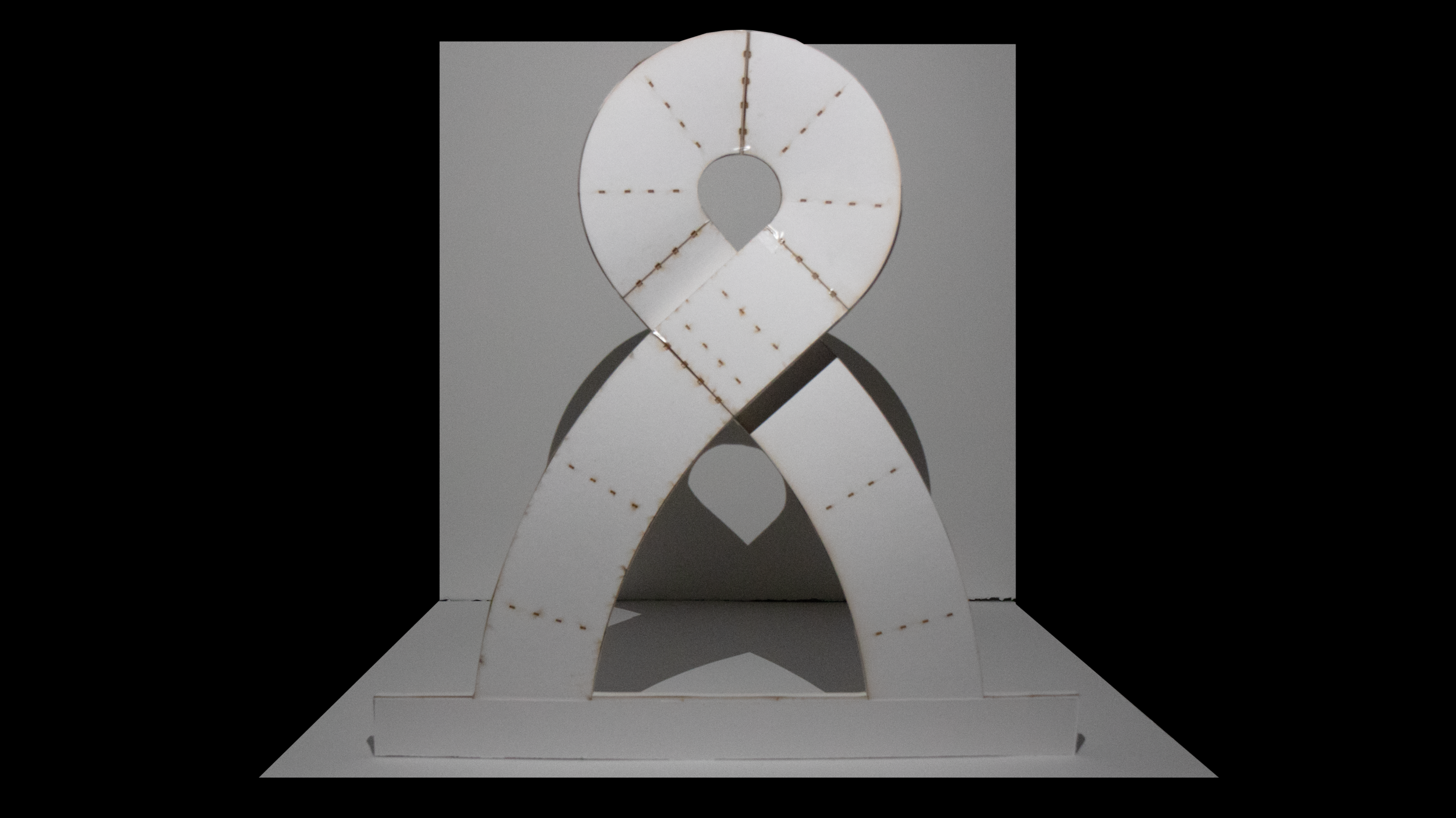
Last, to maintain a stand-alone and complete form that required minimum additional structuring, I further modified the overlapping moment so that the frame looped and swept back towards itself, creating the form that I would carry through the rest of the studio.
One of the main fabricating challenges was achieving the depth implied by the overlapping part of the design. Therefore, I used a method of structural alpha core cross-sections with a paper finish. This combination of rigidity and flexibility allowed the model to be formed into the desired overlapping design, since a too rigid model would have become deformed when being bent into shape.
To make overall model construction more simple, I divided the model into 6 subparts (base excluded). Doing this focused on each moment of the design in isolation and thus made it easier to fabricate a design requiring multidimensional curves using only laser-cut parts. The base piece was added to hold the window together and allow it to stand on its own.
Each subpart, comprised of a stiff bottom sheet and a skin comprised of paper strips, was then attached to one another to ease the process of fabrication while maximizing the overall construction detail of the model.
Additionally, the structural trusses were slotted into the bottom sheet, providing rigidity that would keep the paper skin in shape.
Here is a series of some of in-process subpart construction photos as the model started to come together:
Subpart showcasing a couple strips of paper glued over underlaying truss structures lined across a stiff bottom sheet
Subparts showcasing how one section of the curved window frame overlaps and loops back on top of another section, as well as the truss slotting method into the bottom sheet.
Structure of subpart facilitating the overlap effect of the window frame, with structural trusses visible
One of the two subparts making up the main curve at the top of the window frame, showcasing the two-way curvature of the bottom sheet/trusses and the paper sheet finish
And here is the final model, comprised of all 6 subparts:
Front of model, showcasing the frame detail and connection between the base and frame
Back of model, showcasing the truss slots and curving bottom plate
The physical model ended up being quite accurate through unrolling the model surfaces and then having them be produced by a laser cutter. While I had to bend the base plates by hand to achieve the 3-dimensional curvature, only minor adjustments were needed to achieve the final product.
See the laser cutter print sheets below.
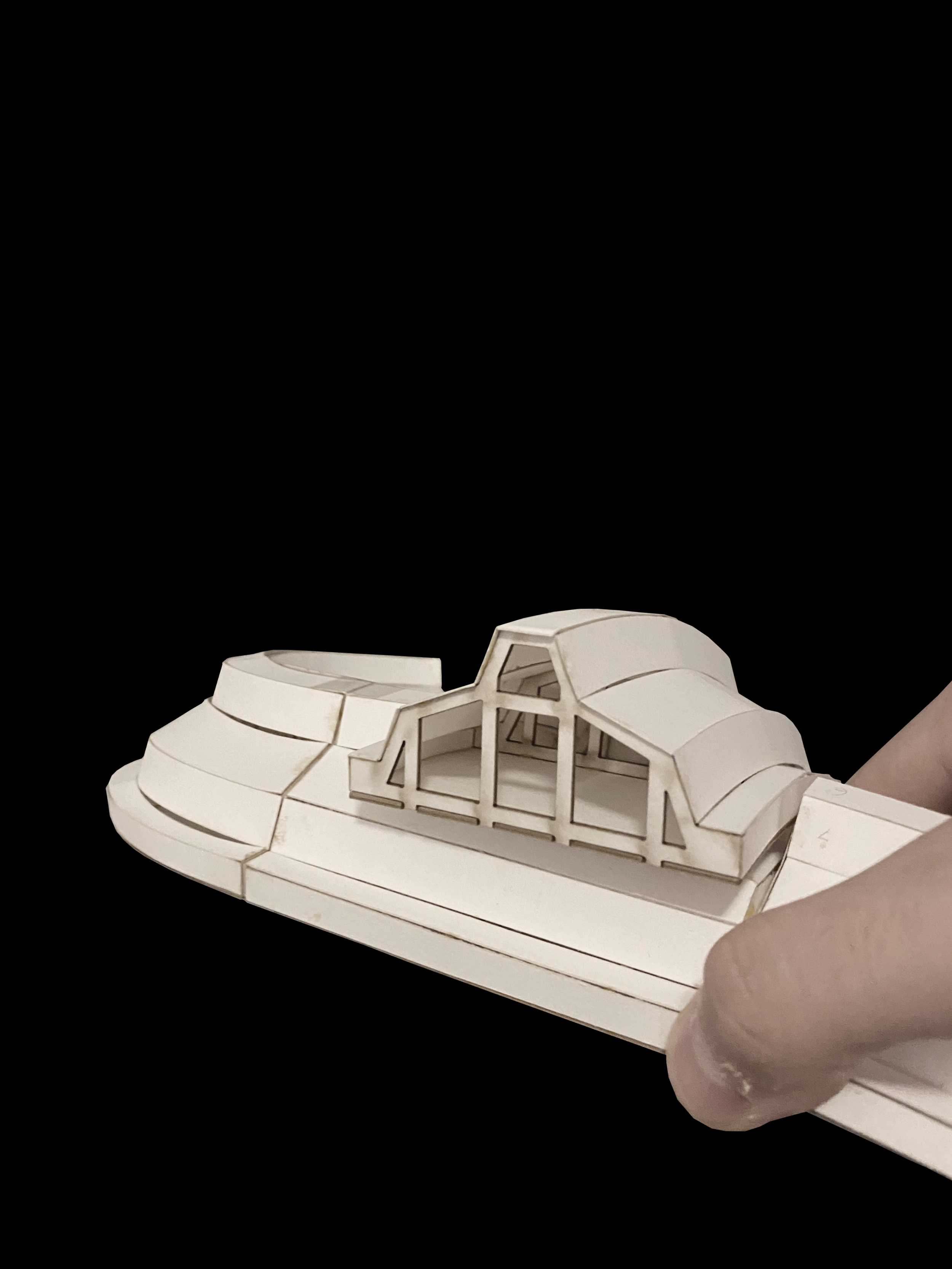
The last part of the studio involved adding context to the window. This not only meant adding background and texture, but also thinking about the interior and exterior environments created by the window’s form and structure.
The next 3 images will represent the exterior environments created around the window, followed by the 3 interior environments.
Original model photo
Preliminary sketch of scene
Colossus
One of the fantastic scenes I imagined after creating the model was of it having a colossal stature. This was partly inspired by the St. Louis Arch in Missouri, which stands at a height of 630 feet. I wanted to convey a whimsical and surreal sense of scale by having the model appear towering relative to surrounding structures.
Original model photo
Preliminary sketch of scene
Oculus
One of the main model features was the circular opening created by the bend at the top of the window frame. By setting the model on the ground and upside-down, the elevation of the frame off the ground inspired me to create a scene emphasizing light permeation. Seeing the model at the scale of a building or sculpture, I wanted to convey a sense of serenity and ponderance with the amount of focus the opening is able to draw.
Original model photo
Preliminary sketch of scene
Pavilion
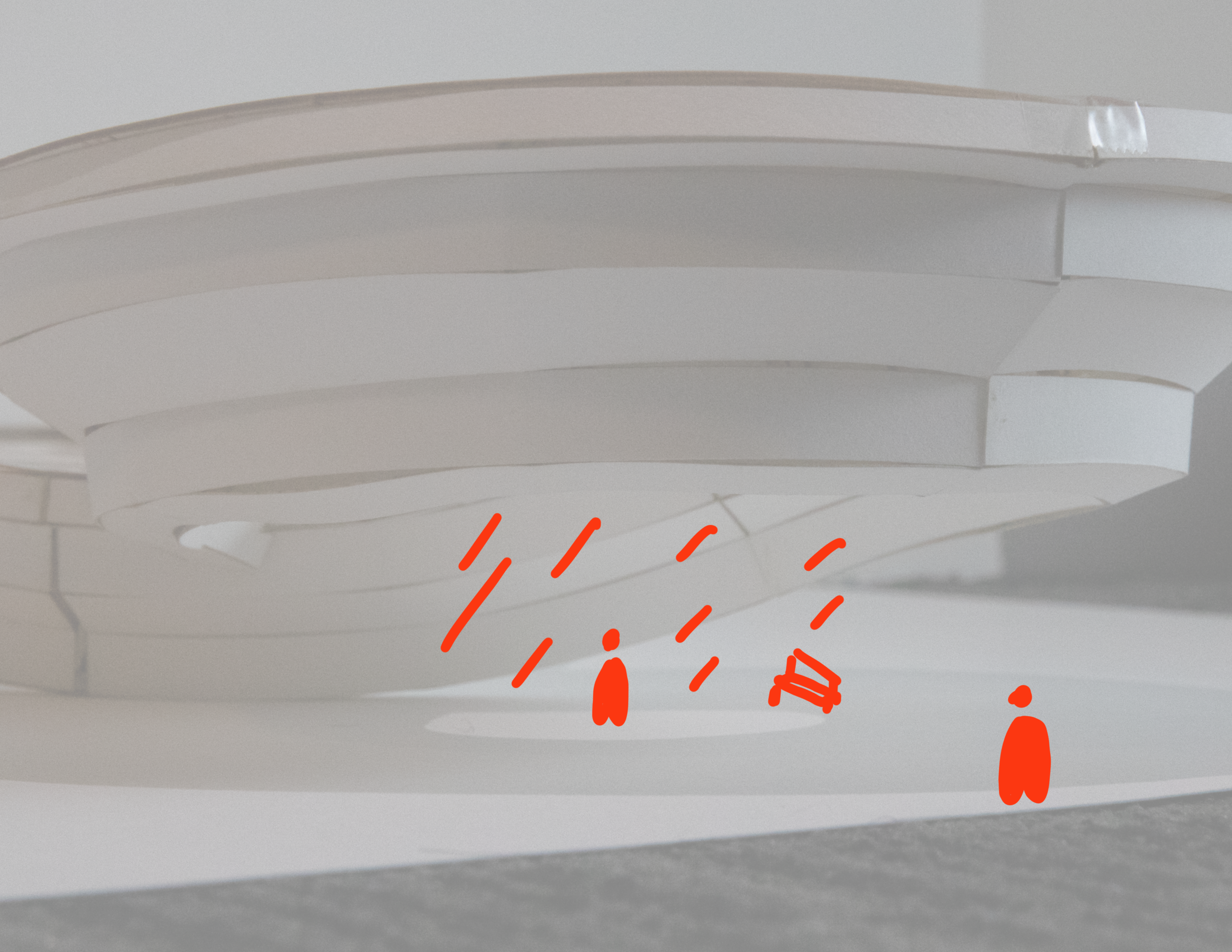
Another setting I imagined was one involving a more human scale of the window frame. I thus wanted to show the frame as an interactive installation where people can use it in various ways such as seating and shelter.
Original model photo
Preliminary sketch of scene
Pirouette
Following the effects created by the circular summit of the window frame, I wanted to use the focused light it draws to generate a more intimate scene. Therefore, I illustrated this with a dancer set in the middle of a vacant hall. I used the linework of the studio’s first assignment to further emphasize the scale of the surroundings.
Original model photo
Preliminary sketch of scene
Underground
As I was constructing and digitally modelling the window frame, I constantly imagined what it would feel like if the hollow structure was a tunnel. Therefore, using a close-up of this hollow interior, I developed a more vibrant scene with the window frame as a ruin embedded in a surrounding landscape.
Original model photo
Preliminary sketch of scene
Overlook
At one moment when I was constructing the window’s physical form, I stopped and captured what I thought was the most “habitable” snapshot of the model. I envisioned what it would feel like to be standing in the open frame, with the ability to see a surrounding landscape. Adding atmospheric qualities such as interior lighting and shade, I wanted to drive home the idea that the shelter provides a protected view of the outside environment.
At the end of this studio, I learned not only how to digitally fabricate a model on my own, but also different techniques that help make certain models cleaner to produce. Additionally, and debatably more importantly, I learned how to see the potential in even the most unassuming of contexts. To siphon meaning from something so micro as a piece of a model has helped me realize that inspiration can truly come from nowhere. It is important to pursue these realizations when they come around, and the techniques to graphically and digitally represent them has been a great takeaway.


